
Colour: Myths, Science And a Realistic Guide
As the year draws to a close, the design industry buzzes with discussions about colour predictions. With eager anticipation, everyone awaits the unveiling of the latest colour trend. Since 2000, the Pantone Color Institute has been the authoritative voice in making colour predictions, aiming to select a colour that reflects an essential societal need in response to global events.
For instance, in 2019, Pantone chose "Living Coral" as the colour of the year, citing its selection as a response to the growing influence of digital technology and social media in daily life, fostering a desire for genuine and immersive experiences that promote connectivity and intimacy. In 2024, the colour “Peach Fuzz” was selected to symbolize our desire for self-care and nurturing. The company also offers different palettes that feature each year's colour. The colours are widely adopted across various industries, including product design, fashion, graphic design, interior design, etc.
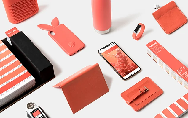
Living Coral
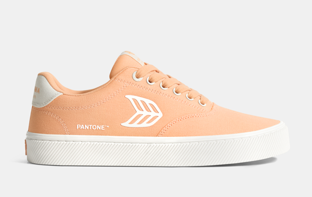
Peach Fuzz
For interior design, it's important to acknowledge that while colour is a powerful design element that can evoke emotions and even elicit reactions, it is misleading to suggest that a single colour has the capability to respond to needs such as relaxation, rejuvenation, creativity, and focus, or solve complex societal issues such as authenticity, belonging and social isolation. It's quite ironic that while Pantone aimed to address authenticity, it did so by endorsing a single colour for everyone.
Paint by Morris & Co
The famous Baker Miller Pink experiment demonstrated that by painting an entire jail cell, including the floor, ceiling, and furniture, with this specific shade of pink, inmates became calmer and less aggressive within just 20 minutes. However, prolonged exposure to this colour had the opposite effect on the inmates, information that the media ignored or wasn't aware of. It's important to note that the psychological impact of the colour can be influenced by cultural perceptions and associations, leading to varying effects on emotions and behaviour. A 2018 study suggested that the perceived femininity of the colour pink in a predominantly masculine setting, such as a prison, could lead to emasculating effects, resulting in reduced aggressive behaviour among men.
The phenomenon of people gravitating towards quick fixes and solutions is evident here despite the unique and authentic packaging. While it's true that humans do respond, to some extent, in a similar manner to certain stimuli, there is no scientific evidence supporting the notion that a specific colour tone has a universal impact. The impact of colour is highly subjective and can vary significantly across different cultures.
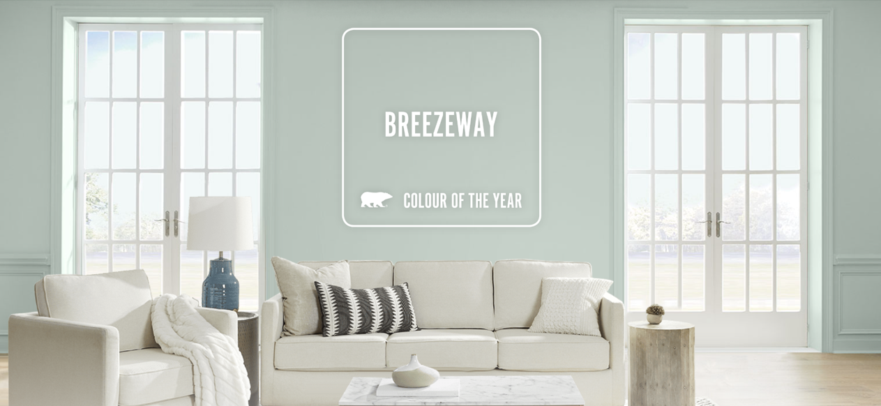
Take Behr's selection of "Breezeway" as the colour of 2022, which evokes a sense of coolness, peace, and a yearning for new experiences. However, personal experiences with colour can vary widely. A friend who painted her entire house this colour and used white furniture found it drained her energy and darkened her mood, prompting her to change the paint.
When launching the colour, Behr showcased it in rooms in its pure form, likely to allow for individual customizations and included it in a comprehensive colour palette complemented by other design elements. Regrettably, many individuals replicate these images, resulting in an undesired outcome
To leverage the positive impact of colour, it is crucial to work with colour palettes and design elements while considering factors such as proportions, scale, balance, and harmony. Furthermore, authentic self-expression and an understanding of personal aesthetic preferences are essential beyond the influence of annual colour trends.


While we understand the potential impact of each colour, our interior spaces are not comprised of a singular hue on every object. Designers address colour as a palette that works alongside lighting, space, and more. The application of colour is complex, and the industry's extensive use of grey and white – worldwide - has emerged from past costly failures with colour. Therefore, sharing a definitive formula for successful colour application is almost impossible. In my article The Joy of Living With Colour, I discuss in more detail the “greying phenomenon.”
My objective is to empower individuals to design visually appealing and healthy environments that embody their authentic aesthetic. In this article, I aim to debunk misconceptions about colour, elucidate its influence and function, and provide advanced advice on utilizing and avoiding pitfalls when working with this powerful design element.
Monochromatic Colour Schemes
A single colour can have a significant impact, both positive and negative, as we saw with Baker-Miller Pink. Consider using monochromatic schemes in rooms with a single function where people don't spend an extended period. A monochromatic scheme involves using different shades and tones of the same colour.
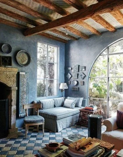
The blue room!
This design exemplifies a masterful application of a monochromatic colour scheme. Although the style might not be for everyone, the room showcases a harmonious interplay of 4 distinct shades of blue, complemented by an abundance of intricate patterns and varied textures. The incorporation of natural wood and stone elements infuses the space with warmth, while the expansive windows seamlessly integrate nature's diverse palette of colours, shapes, and textures. Notably, the wall paint exhibits a nuanced finish that adds depth and dimension to the design.
White
While white is an elegant colour and can brighten up a space, when used excessively, it can elicit feelings of isolation and coldness. White is an excellent background colour and can support a neutral palette. It can also be used in contrast with black or another strong colour to create a vibrant space and accentuate contrast and drama.
This contemporary Poggenpohl white kitchen showcases an exemplary use of white. The white cabinets harmonize with natural wood and a warm-veined black stone, creating an ambiance that exudes understated warmth and sophistication while avoiding a sterile or cold aesthetic.
Grey
Recognized as sophisticated colour, grey is an easy choice for design work. However, it can also evoke feelings of lethargy. When designing spaces intended for prolonged use, particularly during daytime hours, it's best to use it as a secondary or tertiary colour. It’s also essential to consider its cool and warm undertones and determine which works best within the larger colour scheme.
This palette highlights a mid-tone warm grey, emphasizing the importance of using warm hues, textured surfaces, and subtle patterns to create a harmonious, warm atmosphere. These elements integrate seamlessly, resulting in a space that is inviting and suitable for an extended period, despite the presence of grey.
Wall Colours
The selection of wall colours significantly influences a space's ambiance. Feel free to explore vibrant non-neutral colours to achieve a striking effect, if that's the goal. In such instances, incorporating texture and art is crucial for adding visual interest and unifying the entire space.
An example of a bold red walls and ceiling paint colour.
Colour layering
When it comes to achieving depth and comfort, creating a neutral palette and relying solely on accent colours can result in a dull and uninspiring space. A more effective method, which I refer to as 'Colour Layering', involves utilizing multiple tones of a combination of colours. This combination should comprise harmonious and complementary hues, with the main colour(s) being expressed in two or three tones. The key to successful colour layering lies in the proportion of each hue and the placement of colours in relation to one another. Example: the main colours: Blue + Green. The secondary colours are orange and pink. The first step is the choose the the hues of the blue, green, orange and pink that work together. Then. for the Blue and Green, choose 3 hues each, and for the orange and pink, choose 2.
Colour and Light
Light can significantly influence how colours appear, so take the time to observe colour samples under different lighting conditions before you make a commitment.
Climate Considerations
In regions with long, dark winters, bringing vibrant colours indoors will uplift the spirit and compensate for the lack of colour in the natural environment.
Understanding the influence of colour on our well-being and how it is used with other elements of design empowers us to create spaces that positively impact our lives.
Other Articles about Colours you might like The Joy of Living With Colour
With Joy and Delight!